Personal project / 2026
BranchTree
A native Mac app that shows a design team every branch of the work — who owns it, where it forked, and what's quietly going stale — at a glance. Designed and directed by me; every line of code written by Claude Code.

(1)
Three Designers, One Repo, and Branches Nobody Could See
My team builds working prototypes with Claude Code on a single shared project. It's fast — every idea becomes a branch, every variant becomes another one. Within weeks the repo held dozens of live branches, and the picture of the work existed nowhere but in three people's heads.
“Whose branch is this?”
GitHub's branch list is flat and alphabetical. Lineage, ownership, and intent are invisible — you reverse-engineer them from names like onboarding-v2 and hope.
Work died quietly
Explorations went stale without anyone deciding to stop them. On day one, BranchTree's header counted 25 branches · 8 stale on our real repo — two numbers nobody had been tracking.
Drift you can't feel
A prototype forked three weeks ago might be 45 commits behind main. Nothing in the daily workflow surfaces that until merge day.
(2)
The Fix Wasn't a Process. It Was a Picture.
You can't manage what you can't see. The fix wasn't a naming convention or a weekly meeting — it was a picture. The first build was a tidy card list: technically correct, completely useless. The product got its real shape from one burst of pushback, nine minutes after the first prompt, with the first version on screen:
“We want this to be, like, a visual tree that I can see of all of the branches, like, where they branch off from. So show me it visually, like, the list doesn't help me. I wanna see it as, like, a visual tree.”
Me → Claude Code, dictated, May 14 2026 — nine minutes in
(3)
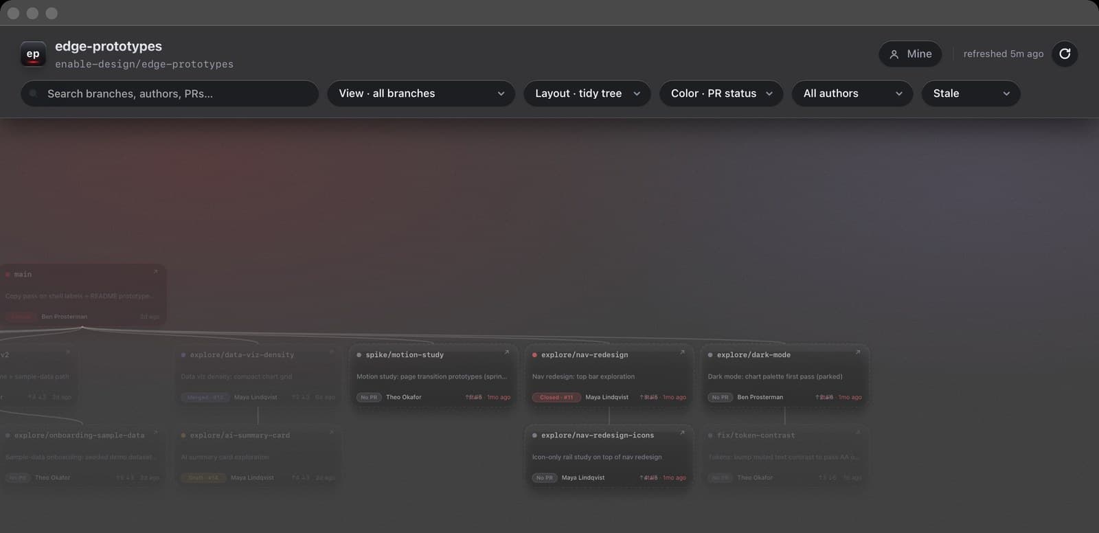
The Product
BranchTree renders every remote branch as a card on an infinite pan-and-zoom canvas — main at the top, descendants below, ancestry inferred from git itself. It behaves like FigJam, because that's the muscle memory a design team already has. Every feature below exists to kill a specific sentence the team kept saying.
Everything a standup needs, on the card
kills: “let me open GitHub and check”
Owner, age, last commit message, PR state as a plain word — Open · #18, Draft · #17, Merged · #13 — plus drift vs main as ↑ahead ↓behind. Branches with no open PR and no commits for 30+ days dim, switch to a dashed border, and wear a red “stale” timestamp. There's no legend; if a card needs a legend, the card isn't done. Hovering any card traces its full lineage in red.
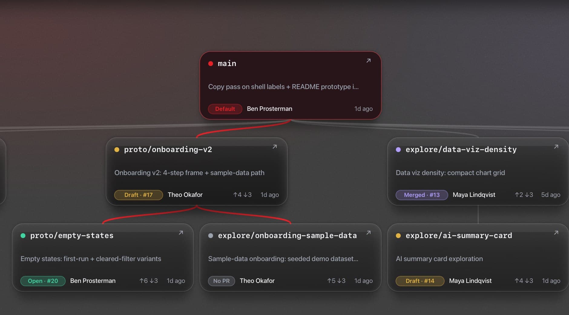
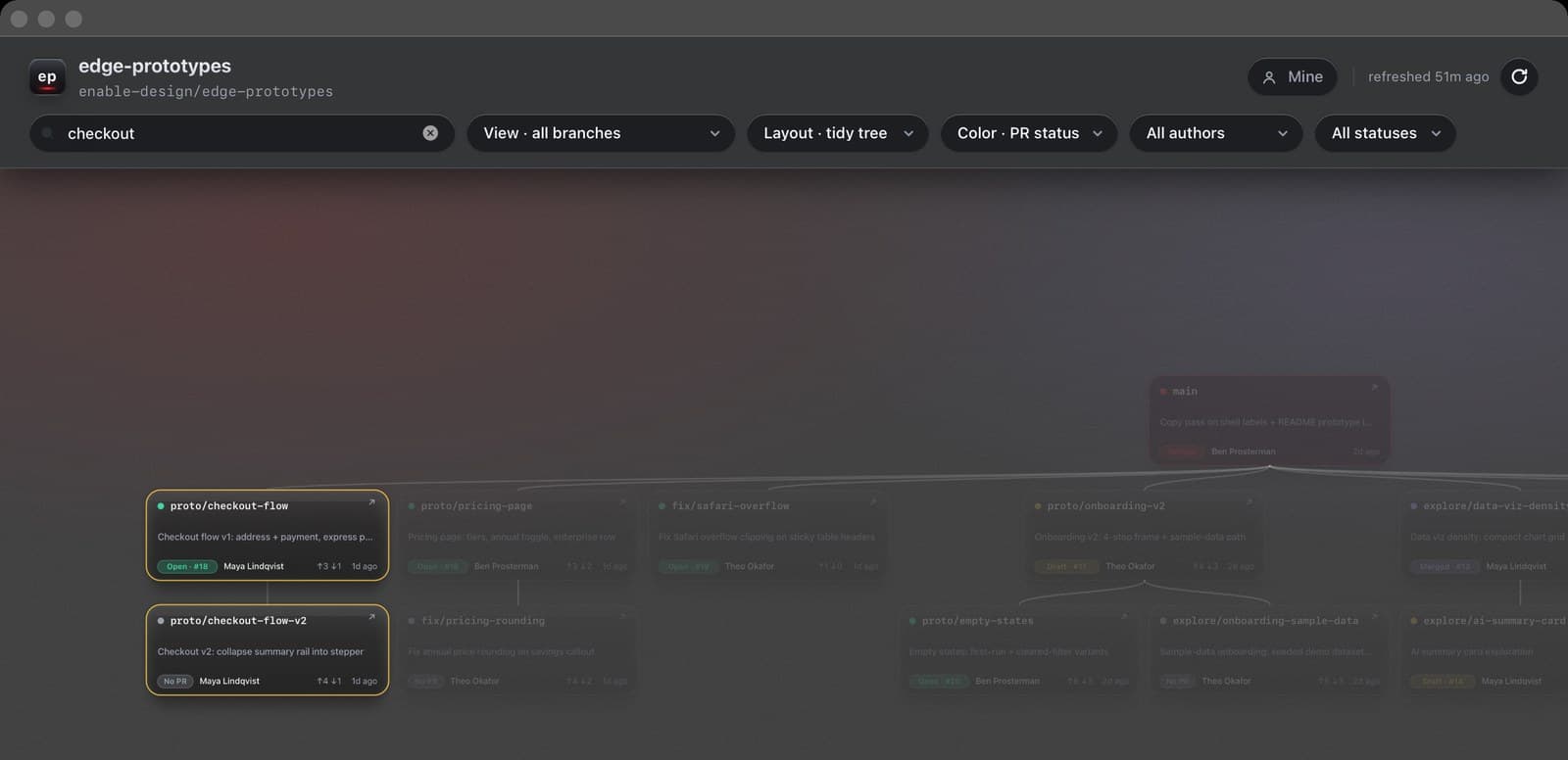
Click a branch, get the dossier
kills: context scattered across five tabs
A side panel slides in: author, exact age, short SHA, drift, “forked from main on June 3,” last commit subject, and the PR — number, state, title, linked to GitHub. Esc closes. / focuses search. Arrow keys walk the actual tree topology.
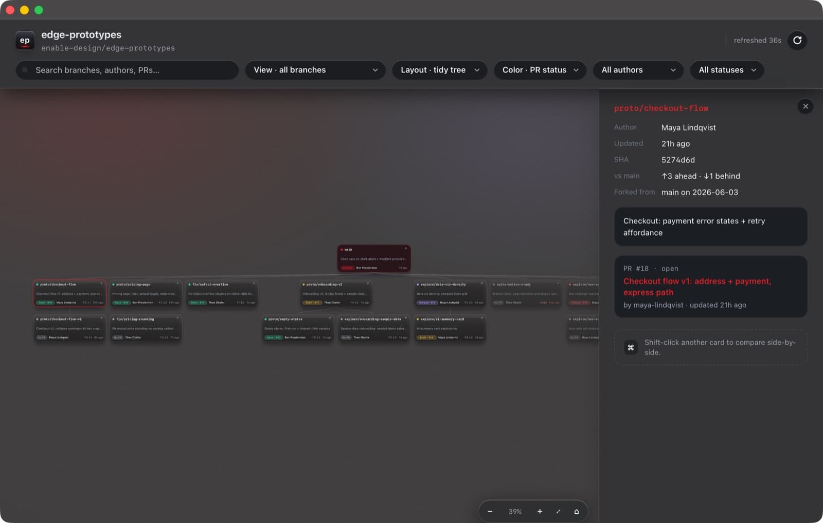
Shift-click two branches. Decide.
kills: “which prototype do we keep?”
Compare mode pairs any two branches — freshness, PR state, drift, fork point, and diff size in added/removed lines. Built for the conversation design teams keep having: two competing explorations, one slot on the roadmap.
Slice by person, slice by lifecycle
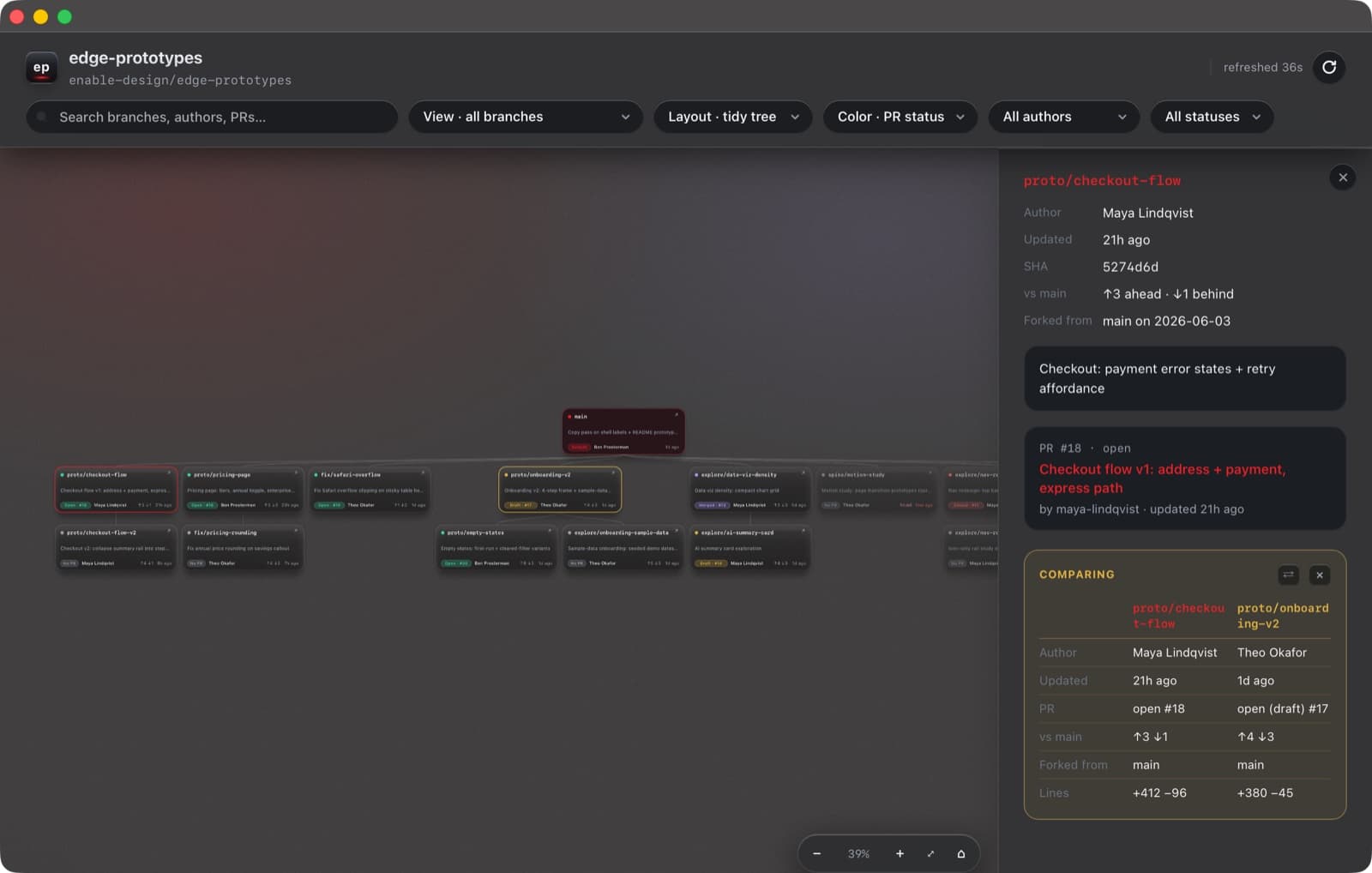
kills: “what's everyone actually working on?”
The author filter answers “show me her branches” in one gesture — everything else dims but stays put, so the tree keeps its shape. The status filter does the same for PR lifecycle, including stale and newly stale — crossed the 30-day line within the last week: the weekly cleanup list, computed for free. A “Mine” pill flips each designer to just their own work.
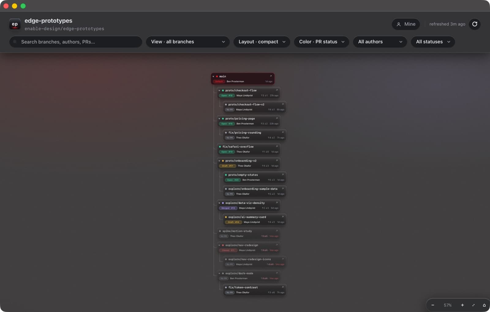
Two layouts, one mental model
kills: the canvas outgrowing the screen
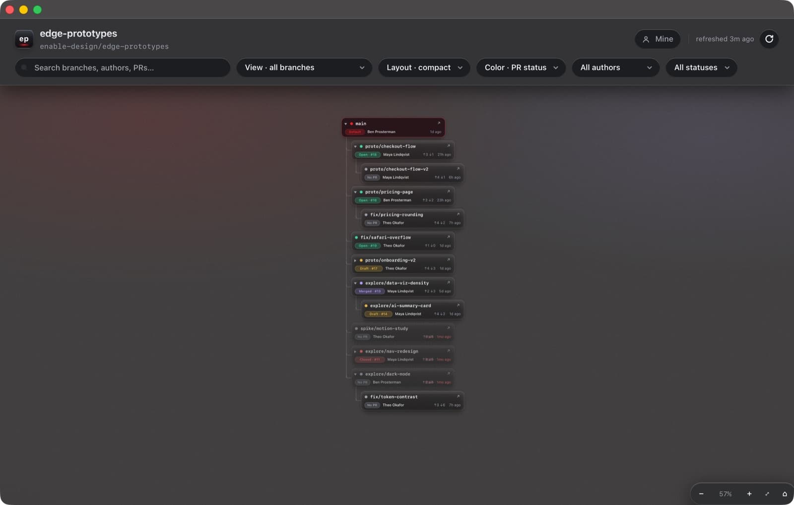
A compact mode restacks the tree as an indented, collapsible file-tree — fold a finished family of prototypes out of view entirely. Search dims, never hides: you find one branch in twenty-five without losing the spatial context.
Honest data, honestly presented
kills: “I pushed — why isn't it on the board?”
GitHub Actions republishes branch and PR data on every push; the app's local server proxies it live; manual refresh does a real git fetchplus recompute in ~7 seconds and reports the truth: ✓ Updated, ✓ Up to date, or ⚠ Couldn't refresh. Background refreshes rebuild the model in place — selection, zoom, and pan survive. And every bit of view state lives in the URL, so a filtered view can be Slacked to a teammate as a link.
Native glass, real Dock identity
kills: “it's just a browser tab”
A real compiled Mac app: a vibrancy window with the desktop glowing through dark glass, a draggable chrome strip, a window that remembers where you left it. It launches its own data server, health-checks it, and reuses it across launches. And it has a real identity — its own Dock icon, with dedicated, simplified small-size artwork so it stays crisp at 16 pixels.

The app icon, rendered through its own pipeline: art authored as HTML, screenshotted by headless Chrome, and assembled into an .icns with size-routed masters — the 16–64px sizes use bolder, simplified artwork per Apple's guidelines.
(4)
Built with Claude Code, by a Designer
I didn't write the code — I directed it. Most prompts were dictated out loud, mid-thought, the way you'd brief a teammate across a desk. The other half of this case study is that this worked.
3h 58m
first prompt → zipped, installable Mac app, the same afternoon
15 days
first prompt (May 14) → v2.1 installed to /Applications (May 29)
5,877
lines Claude wrote — dashboard, native shell, data pipeline; none generated by hand
76
prompts from me across two build sessions, most dictated out loud
Fifteen days, end to end
One dictated ask: “I need a way to visually keep track of all of the branches…” Claude Code asked four scoping questions, then built a live dashboard pulling branch and PR data from the team repo.
The pivot that named the product: “the list doesn't help me. I wanna see it as, like, a visual tree.” Parent-inference cycles and orphan branches were solved the same hour.
v1 ships to the team repo: five files, 1,072 lines, opened as a PR from a throwaway git worktree so my uncommitted design work stayed untouched. Merged that afternoon.
“can you make this a mac app for me that can live in my doc.” Three window-shell attempts later — a bouncing launcher, a Dock that insisted it was Chrome — Claude hit a broken Swift toolchain, rewrote the shell in Objective-C with system clang, and BranchTree.zip was on my Desktop. First prompt to installable app: under four hours.
The 9 PM design correction: I rejected the over-layered “liquid glass” restyle and asked Claude to design like a very senior designer. The rebuild earned “The work you did is fantastic.” Claude then audited its own code and shipped twelve of the audit's recommendations — URL state, keyboard nav, compare mode, saved views, an XSS fix — deferring two, with reasons.
“Can you add opacity to the actual app” — browsers can't, so the dashboard moved into a native vibrancy window. Light mode was demoted to a quick-settings switch that afternoon, and deleted entirely in the May 29 pass. Then the harder fix: refresh that actually fetches, because trust in the data is the product.
The Tesla pass → v2.1: the redesign brief landed at 11 PM — true black, dark glass read by lit edges, one red accent. By 9:12 the next morning a compiled app bundle had replaced the script shell, scrolling had moved to GPU-composited transforms, and v2.1 was installed to /Applications.
Real prompts, verbatim
Most voice-dictated · typos preserved · nothing rewritten
“I need a way to visually keep track of all of the branches I'm working on in GitHub. I need you to create a visualization of all of the branches that I can, like, be able to follow and see with, like, notes around them. and who's working on what? When he was last updated?”
The first prompt — May 14
“can you make this a mac app for me that can live in my doc”
The pivot to native — May 14
“You did not follow the instructions properly, it looks really bad still. There's like boxes around every single box… Also, like, think about if you're designing this as if you were a senior, like, a very senior designer.”
The 9 PM design correction — May 20
“I'm not seeing my latest branches. Like, I just made a branch update right now, and I know for a fact I did… So you need to actually address this. Don't just ignore”
The trust demand — May 26
“I want you to think of Tesla style of liquid glass… I want you to also redesign the app icon. Overall, this needs to be leveled up… following, like, world class design standards and setting the standard.”
The final design brief — May 28, late night
“I need you to fix all of the scrolling that's on this app. It needs to work flawlessly… like it does in an app like FigJam.”
The performance bar — May 29
(5)
What Took Iteration — Honestly
- The draggable title bar took three tries. Two custom overlay schemes failed before Claude conceded “I'm overthinking this” and used a standard tinted macOS title bar. Boring won.
- Swift never compiled on this Mac (a Command Line Tools compiler/SDK mismatch). Claude diagnosed it, shelved a full SwiftUI rewrite as a portable zip, and shipped the app in Objective-C — which compiled fine.
- The data pipeline fought back for days: failing CI emails, a Pages permission wall, an unreliable cron. The fix went local — publish to an orphan data branch, proxy it live, rebuild on demand; a 42-second recompute became 7 by replacing an O(n²) loop.
- Gradients banded, zoom blurred, icons mushed at 16px. Each got a real fix: oklab color interpolation with noise dither; vector zoom via the SVG viewBox; dedicated simplified small-size icon art.
(6)
Outcome
BranchTree has lived in /Applications since May 29 and is open on this Mac right now — its own launch log counted roughly twenty opens in the first two weeks. It turned three invisible workstreams into one shared picture.
- Standup: “what's everyone on?” is a glance at the author filter, not a screen-share through GitHub tabs.
- Weekly sweep: the newly-stale filter makes prune-or-revive a deliberate decision instead of an accident.
- Review & share: saved views one-click the recurring questions; any view travels as a deep link.
From the README Claude packed into the team zip on day one: “To get fresh data, ask Ben Prosterman for the latest BranchTree.zip.” The app was built to be handed out.
An honest footnote: every statistic, date, and quotation above is sourced from the project's session transcripts, git history, filesystem records, and the shipped code. Screenshots are the real app at retina resolution, pointed at a staged demo repository — branch names and two of the three author names are fictional, because the team's real repository contains colleagues' names and internal project details.
(7)
Reflection
- Direction is a design skill. The quality bar lived in the prompts — “design like a very senior designer,” “flawless like FigJam,” the Tesla brief. The judgment was the input; the code was the output.
- Review the AI like a teammate. The single highest-leverage prompt was asking Claude to audit its own build: it produced a brutal list of decisions that aged badly, then shipped twelve fixes — including the URL state and keyboard navigation that define the product today.
- Knowing when to stop designing is design. Three custom title-bar schemes lost to the standard macOS one, and the deleted legend made the cards better. The discipline to choose boring is part of the craft.
Next Project
Enable
Partner Analytics & Insights