Enable / 2025 to 2026
Enable Edge
Designing trust-first AI for commercial decision intelligence.
(1)
The problem
Commercial teams managing rebate portfolios leave money on the table at renewal, not because they don't care, but because finding which agreements are underperforming is slow, manual, and disconnected from the data that should be driving those decisions. Rebate managers work across spreadsheets, renewal calendars, informal email approval chains, and years of accumulated intuition. No tool looks across the whole portfolio and tells them which agreements to change, what to propose, and whether the change worked.
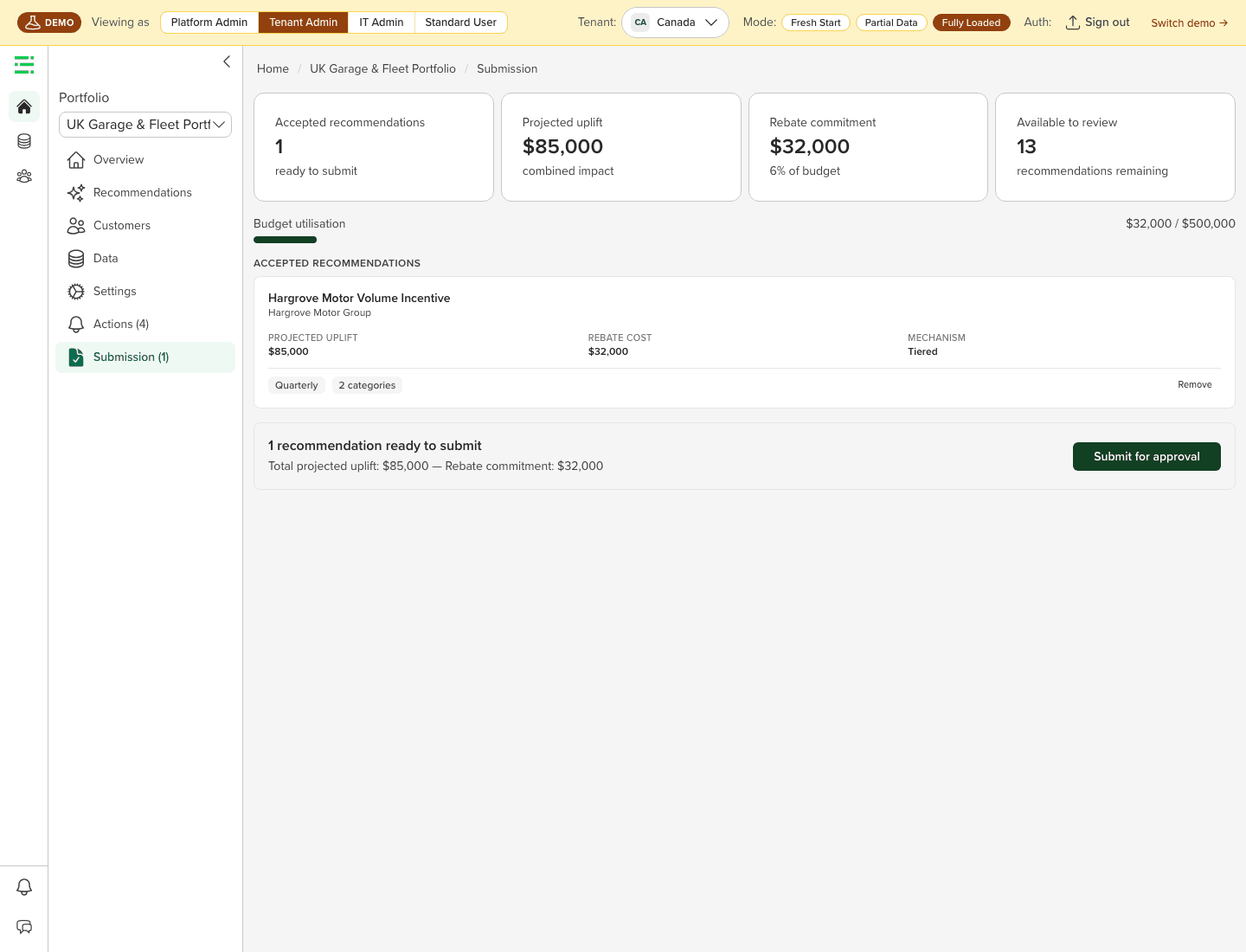
Enable's existing products help customers calculate and execute rebates, but they don't tell you what to change or why. Enable Edge is the intelligence layer above that execution: it ingests transaction, agreement, and earnings data; uses constrained optimization and surrogate ML models to identify better rebate structures; produces explainable recommendations; lets teams simulate impact; routes decisions through approval workflows; and tracks whether recommendations worked after implementation.
The design challenge wasn't building another dashboard or AI chatbot. It was earning enough trust from rebate managers, category managers, and commercial finance teams to put real commercial money behind a machine-generated recommendation. Customers liked the promise of AI-generated recommendations, but research showed they wouldn't act unless Edge explained the math, respected contract timing, used their language, and fit real approval workflows.
(2)
My role
I worked across the Enable Edge project as a senior product designer and research contributor, running and observing customer UXR sessions, authoring debriefs, building the working prototypes we tested in front of customers, contributing to product requirements across the full experience arc, and helping shape the executive launch narrative. I don't hand off specs and walk away; I build production-grade React prototypes myself, which is how the screens in this case study got in front of real customers.
- Facilitated the White Cap UXR session and authored the session debrief, the one session where the full portfolio-creation flow was directly testable
- Observed the NCBP, WSH, and HSM sessions; prepared and hosted the Azure-deployed UXR builds the sessions ran on
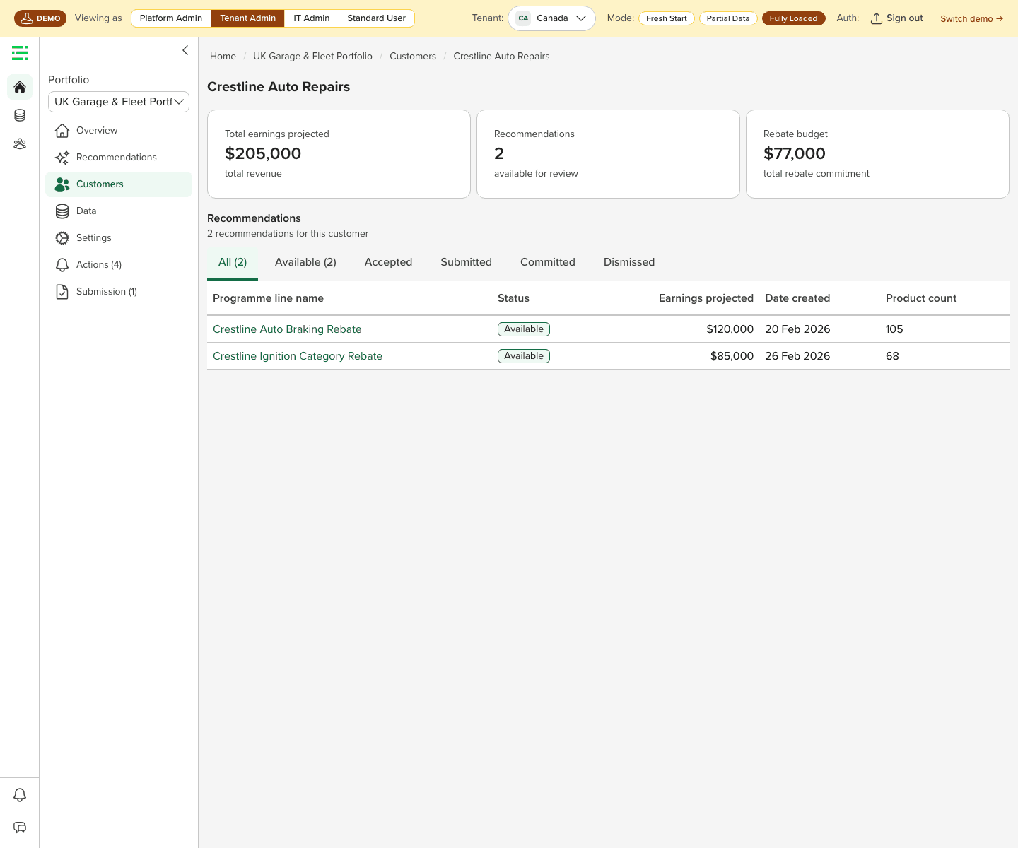
- Built working React/Vite prototypes (Enable design system, Recharts, React Router) covering portfolio review, recommendation detail, simulation, onboarding, data management, permissions, and a long-range workspace vision
- Contributed design thinking across data onboarding, first-time login, portfolio builder, recommendation detail, simulation and assistant, workflow approvals, and benefit tracking
- Worked with PM, engineering, and data science to define requirements, surface launch risks, and pressure-test the experience against real customer scenarios
(3)
Discovery and research
I ran moderated usability sessions with four customers across commercial finance, rebate management, category management, and business performance roles, five participants in all. These were exploratory sessions: validating direction and surfacing trust blockers, not benchmarking a finished product. Three of the four had to be screen-shared because corporate firewalls blocked the prototype, which makes the portfolio-review findings higher-confidence than the creation-flow findings. Average direction score: 4.6/7 (where 7 = "absolutely the right direction"), a strong opening signal for an early prototype, not final validation.
White Cap
Category management + accounting/finance
Strong pain validation: White Cap already does manual tier restructuring in spreadsheets today. The critical moment came when the finance lead found the old-vs-new tier comparison, up to that point the AI insight text hadn't landed at all. Once she saw the visual side-by-side, the recommendation became concrete and credible. The category manager rated the portfolio-creation flow 2/7, he said he wouldn't click "Create a Portfolio" because the word was too abstract and "sounded like something he could break." A calculation error in the mock data actively damaged trust and became the trigger for the "show its work" requirement.
NCBP
Rebate management
Every computed number needed a visible source before the rebate lead would trust it. The session surfaced a strategic signal: for NCBP, supplier-side optimization was potentially more valuable than customer-side, on the customer side he didn't want to give away more rebate dollars; on the supplier side he always wanted to receive more. He was also actively evaluating whether to continue with Enable, which raised the stakes on getting the numbers right.
WSH
Rebate / commercial operations, £116M in rebates, 900 contracts, 600 suppliers
The concept was understood and valued, but the interface didn't lead with the most important information, it had detail but no headline. "Months at top tier", how long a supplier has sat at the maximum tier, was the most commercially actionable signal the commercial finance lead had seen: reach the top tier too early and the team can add a new trigger. He warned that recommendations should feel like options, not orders, or buyers would feel their negotiation role was being replaced.
HSM (Hilton Supply Management)
Business performance, multi-year fixed contracts
Many HSM contracts are fixed for multiple years, making mid-cycle tier restructuring unrealistic, so the more actionable output is threshold proximity (how close a supplier is to the next tier gate), not always a new structure. Before even seeing the screens, the director of business performance raised whether the AI shares data across the supplier network. Leadership demos now need a data-privacy and model-provenance opening before the product walkthrough.
Key findings
- Visual tier comparison beat AI text summaries in every session, the old-vs-new structure was the clearest, most trusted representation of a recommendation
- Every computed number needs a visible calculation path, arithmetic inconsistencies were spotted across multiple sessions, and an actual mock-data error damaged trust on the spot
- "Portfolio" didn't map to user mental models, users think in contracts, suppliers, categories, or customers
- Recommendations need contract-lifecycle context, when a recommendation can be acted on matters as much as what it says (fixed contracts, renewal windows, in-year vs renewal)
- Terminology created friction at every level: uplift, portfolio, revenue, budget, previous structure, accepted, available
(4)
Design approach
The central insight from research: the AI recommendation isn't the product, the evidence is the product. Users didn't reject AI. They rejected unsupported AI. The design had to shift from "here's what the AI thinks you should do" to "here's the commercial case, here's the math, here's when to act." A principle I held throughout: embed the intelligence legibly in the native product, no sparkle icons, no gradient "AI" treatments, no bolted-on panel. The best AI feature doesn't feel like an AI feature; it feels like the product just got smarter.
Lead with old-vs-new, not AI text.
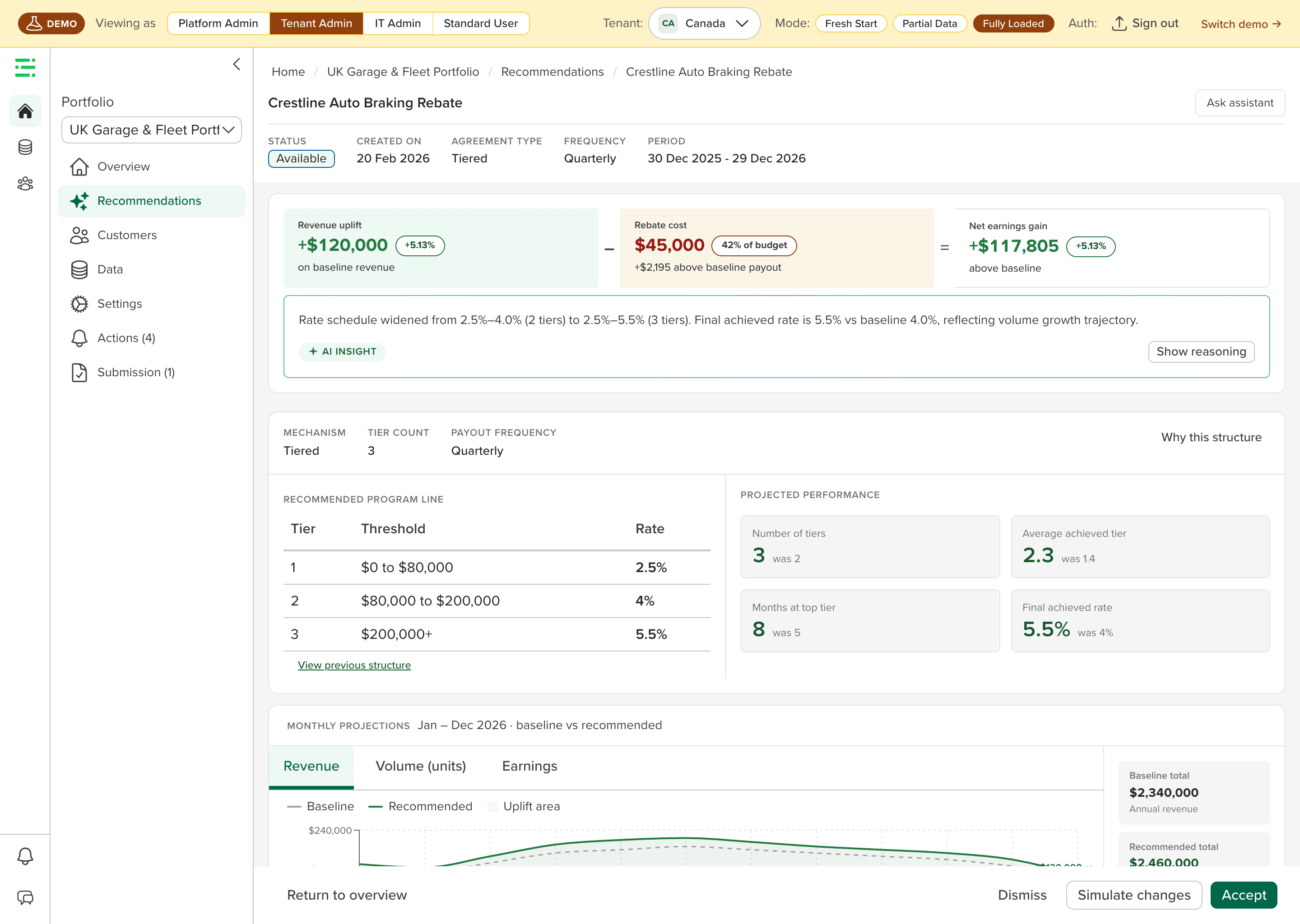
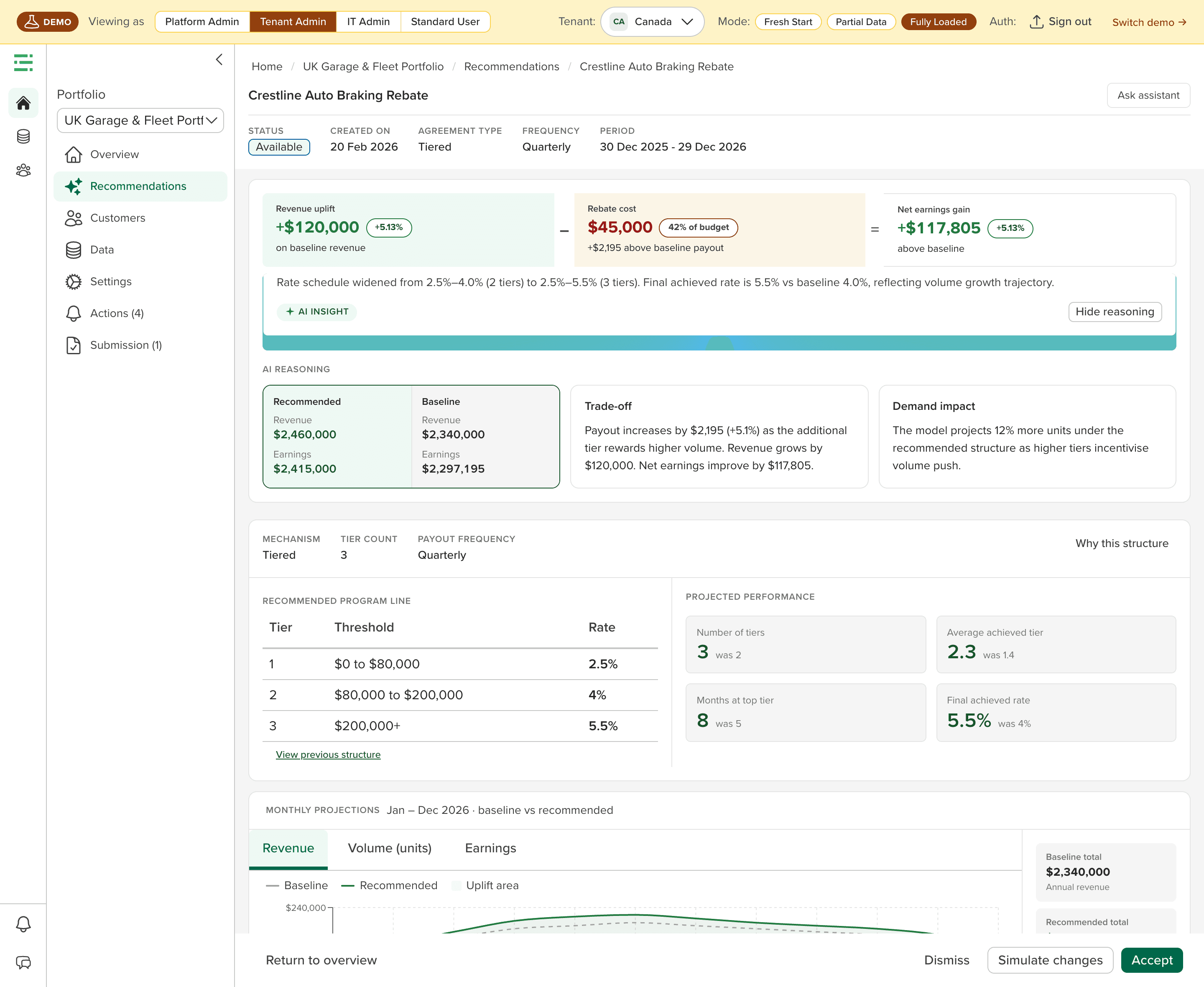
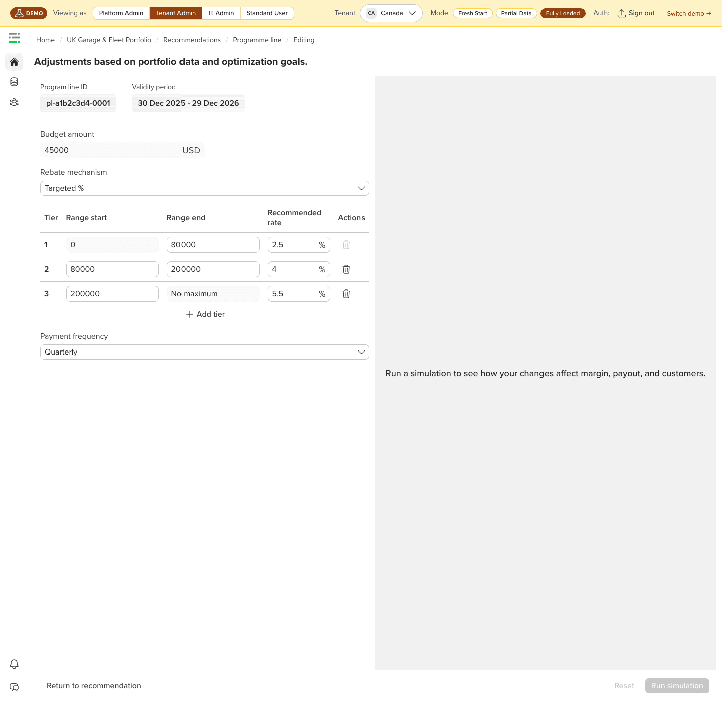
The old-vs-new tier comparison was the strongest trust signal across all four sessions. The recommendation detail redesign makes current-vs-recommended structure the hero of the page, above the AI insight summary, not below it. Users need to see what changed before they care why.
Design recommendation detail like a decision memo.
Every field maps to a traceable source. The page answers: what structure is recommended, the math behind every figure, the baseline assumptions, the contract-lifecycle timing, how confident the model is, and when to act. Explanation lives in the numbers: formula plus prose, because prose alone reads like commentary while formula plus prose reads as audit, not boxed off in a separate panel.
Move portfolio creation from conversational wizard to visual canvas.
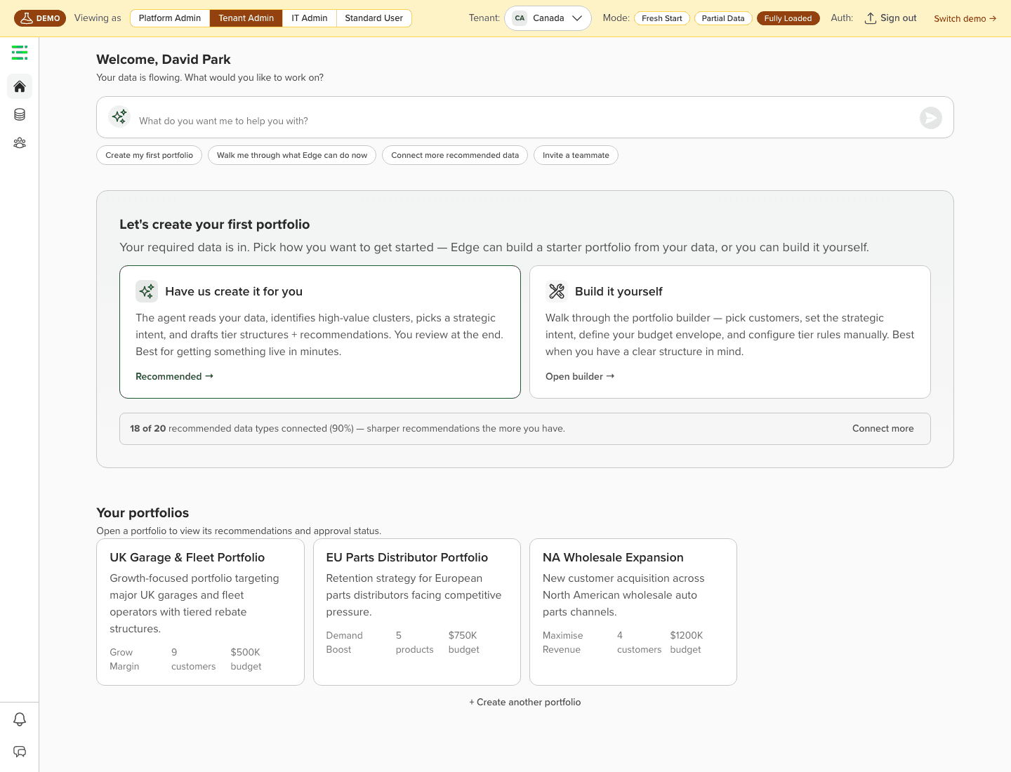
Early research showed users struggled with both the concept and the word "portfolio"; the chat-driven wizard felt too abstract. Portfolio Builder V2 moves configuration to a builder canvas, users watch the scope take shape in real time as they pick intent, customers, products, agreements, and constraints, with coverage and projected outcomes updating live. The assistant moves to a guidance-and-explainability role, and the builder can be completed without it.
Treat workflow governance as a first-class product surface.
Research confirmed commercial rebate decisions aren't unilateral, customers currently run approvals through email and spreadsheets. The workflow builder gives admins condition-based rules, sign-off chains, clash detection, and an immutable audit trace. Without it, recommendations have no route to action.
(5)
Prototypes and iteration
I built working React/Vite prototypes, using the Enable design system, Recharts, and React Router, covering the full experience arc. These weren't visual shells: they encoded product thinking, and the same builds went straight in front of customers in research.
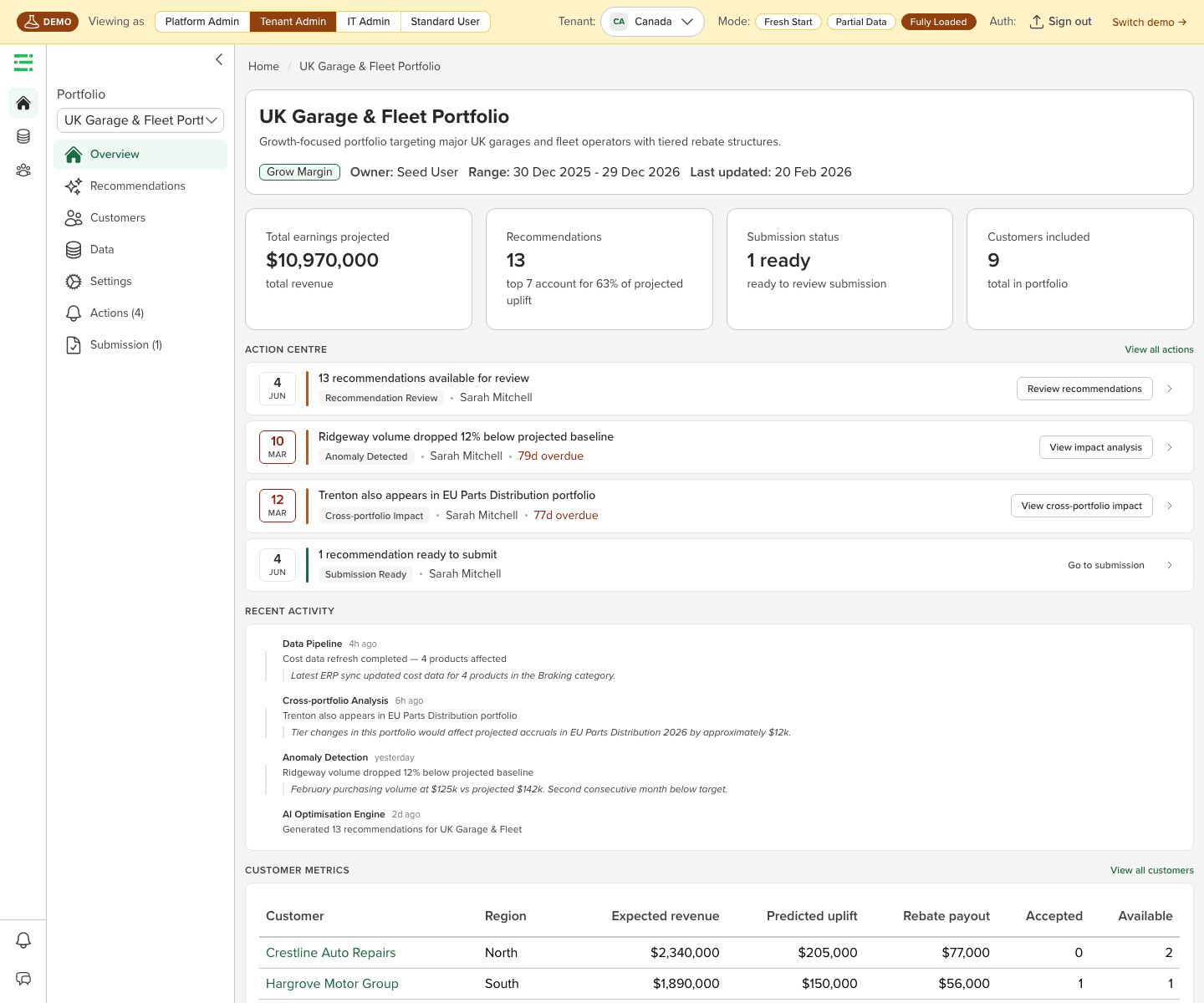
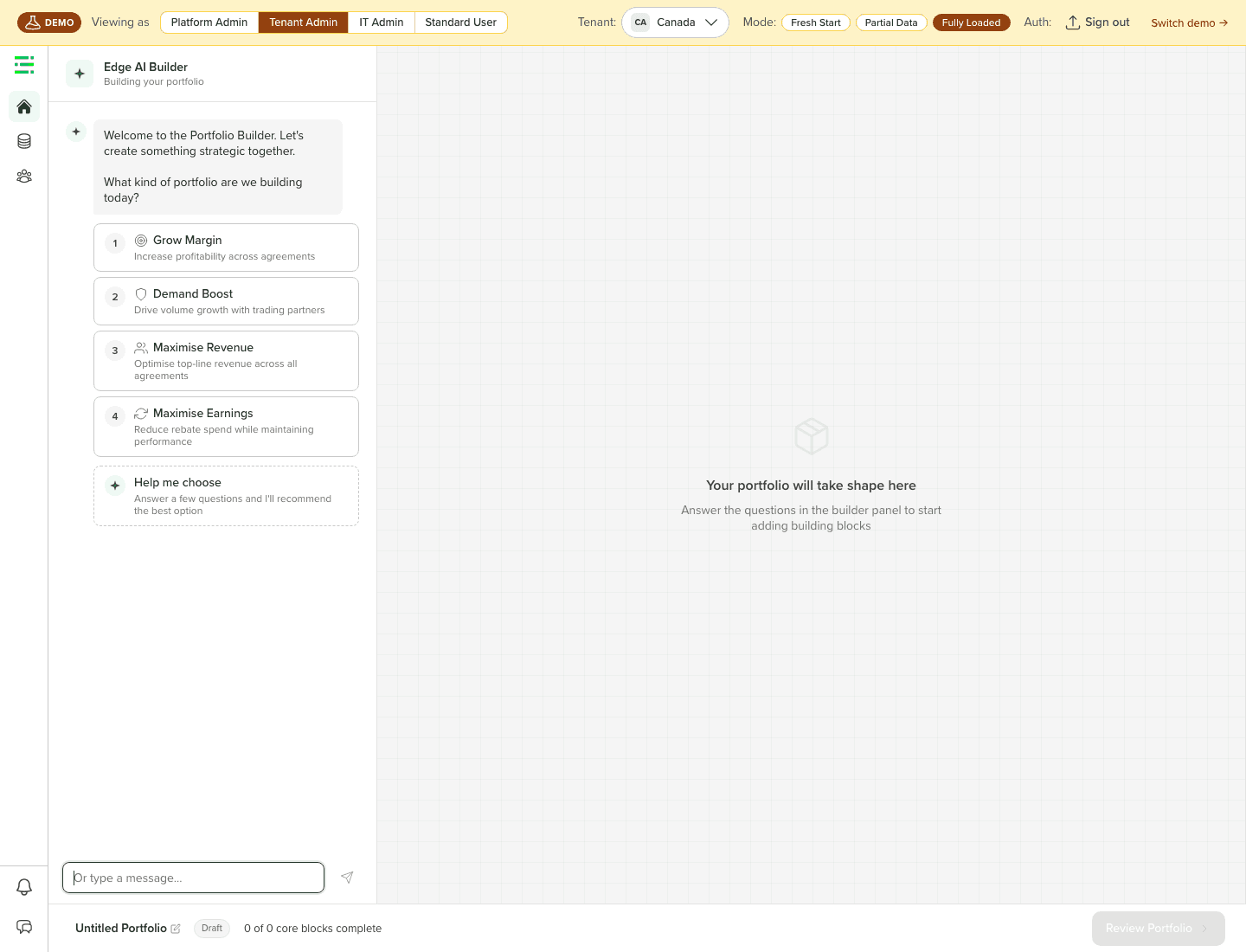
The most significant pivot was the portfolio builder. After White Cap scored the creation flow 2/7, it was clear the conversational wizard was the wrong primary surface. V2 moves configuration onto a canvas where the scope builds in real time, while the assistant handles guidance and follow-up, a correction that matched what every session was telling us about "portfolio" as a concept.
(6)
Outcome
Enable Edge is targeting a Q3 2026 GA launch with rebate optimization as the first commercial wedge, an adjacent use case current Enable customers can adopt side-by-side, producing proof points for customers and investors. Pre-launch milestones at the time of writing:
The post-launch proof is what matters, and I'm honest that it isn't in yet: adoption rate, recommendation acceptance, simulation usage, approval throughput, and whether benefit tracking shows Edge's recommendations actually improved commercial outcomes. The customer pipeline reflects the same pre-launch reality, one of four data partners secured, design-partner recruitment still open. The current evidence says the direction is right. The next phase is proving it at scale with real customer data.
What I'd Do Differently
- Research the actual daily users, not just their managers. In three of four sessions, managers told us the real daily users would be category managers, analysts, or data stewards, someone else. The product has been shaped by how managers described the problem. I'd push harder and earlier to recruit those front-line users before more design decisions were locked.
- Treat terminology as a launch gate, not a follow-up. Uplift, portfolio, revenue, previous structure, budget, these terms created friction in every single session. A terminology audit should have been a P0 requirement before any customer sessions, not a debrief action item; running sessions with ambiguous language cost us research fidelity on every call.
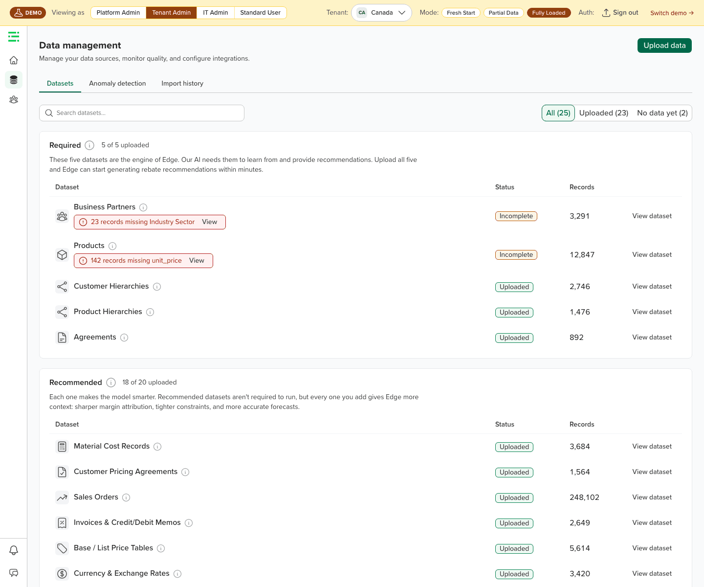
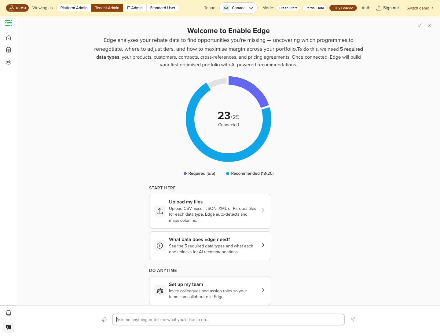
- Design data readiness and recommendations together from day one. Data trust is the prerequisite for recommendation trust. The recommendation detail experience was well-specified early; first-time login and data quality exposure came later. The cleaner approach is to design the full trust arc: data in, readiness visible, recommendations credible, as a single continuous experience from the start.
More from the prototype
Next Project
Enable
Enable Edge SSO